
How to grow app retention matching copy with design? A few words on app consistency

Imagine you see a movie trailer. It’s dynamic, full of special effects, beautiful visually and with witty dialogues. Bombs are exploding, guns are shooting, cars are chasing, actors are flying. Let’s say you love action films and this looks like something for you. You go to the movies, the film starts and all of a sudden you hear children’s voices instead of tough action film characters. Actually, you realise it’s educational film for kids. 3 hours lecture on the life of some insect living somewhere in Siberia. No action, no bombs and explosions, no special effects. How would it make you feel? Would you be satisfied? Wouldn’t you feel lied to?
Now…
Let’s forget about film trailers and let’s try to consider the same problem with mobile applications. How often does it happen that you have to download an app, and the design and copy just don’t fit? The app has features that you need but with funny, colourful design comes weirdly formal copy? Or the app that is supposed to be fun uses boring design that just doesn’t comply with the features. How many times App Store Page lied to you? Promised features and benefits, presented simple, fun app that didn’t work as well as promised after downloading? Do you like using such application? Do you come back to it often?
You forget about those 4 things — your app’s dead in the water
When planning an application, owners usually think of its features, tech stack, team and (unfortunately not always) the target audience, often leaving things like design, UX, copy or App Store Optimisation for the final stages of planning and development. After all, you can build a working application without giving much thought to those details but the fact is that design is not just an eye candy for users and copy is not just a way of telling users what to do. They’re all part of a living organism that your app really is. If they don’t work well together, your chances of getting millions of downloads are melting down.
Of course, it doesn’t mean that applications that don’t have beautiful design and copy matching their features never get popular but take a look at apps with most downloads. Just to be clear, we’re not talking about “pretty” here. Beauty is in the eye of the beholder;). We’re talking about mobile app consistency and well-oiled machine that sends the same message to your audience through graphic design, descriptions, onboarding, and promotion.
Mobile App Design
Design
The first question you need to ask yourself is: who your mobile application is for? Who’s going to use it? Who do you want to target it to? Then try to imagine what these people like. What other apps do they use? Think of apps that aren’t just your competitors with similar features. Think of most popular apps that target your audience.
- Are they serious? Colourful? Friendly?
- What films is your target audience watching?
- What brands do they like?
- What are they interested in?
- What are their problems and hobbies?
Once you know who they are, you can create a mood board with inspirations for colours, design details etc., and send it to your graphic designer and keep everything consistent. This kind of inspiration mood board will be useful not only for your app and app store page design but also for ads, press releases and general identification of your product. Don’t ignore global trends and don’t just look at tech products. Keep your eyes wide open for fashion, design, films and music trends. Inspire yourself to keep your identification fresh and up to date with trends. It may seem like something not very important but the lack of consistency is visible to users and it gives users bad impression of the product that is not fully professional.
Copy
When thinking about copy, try to imagine you’re talking to your users, like in real life. It’s just like with the graphic design: first, you should make sure WHO you’re talking to and what they’re looking for. Are they teenagers looking for some fun with friends? (Helo Snapchat!) Are they HR professionals looking for new candidates? (We’re looking at you LinkedIn) Or maybe parents concerned about their kid’s safety? (Yea, you 99check). For each of these groups, you would probably speak in a little bit different way, right? More friendly and laid back, more formal, more caring and understanding. This is how you should write to your users every time you communicate them something with your copy. Make sure you use the same language in your app, App Store page, emails, notifications, website, etc. You can prepare a table of words that reflect your vision and those that don’t fit. Use this table whenever you or one of your team members writes new copy, press release or blog post.
Good examples:
VSCO
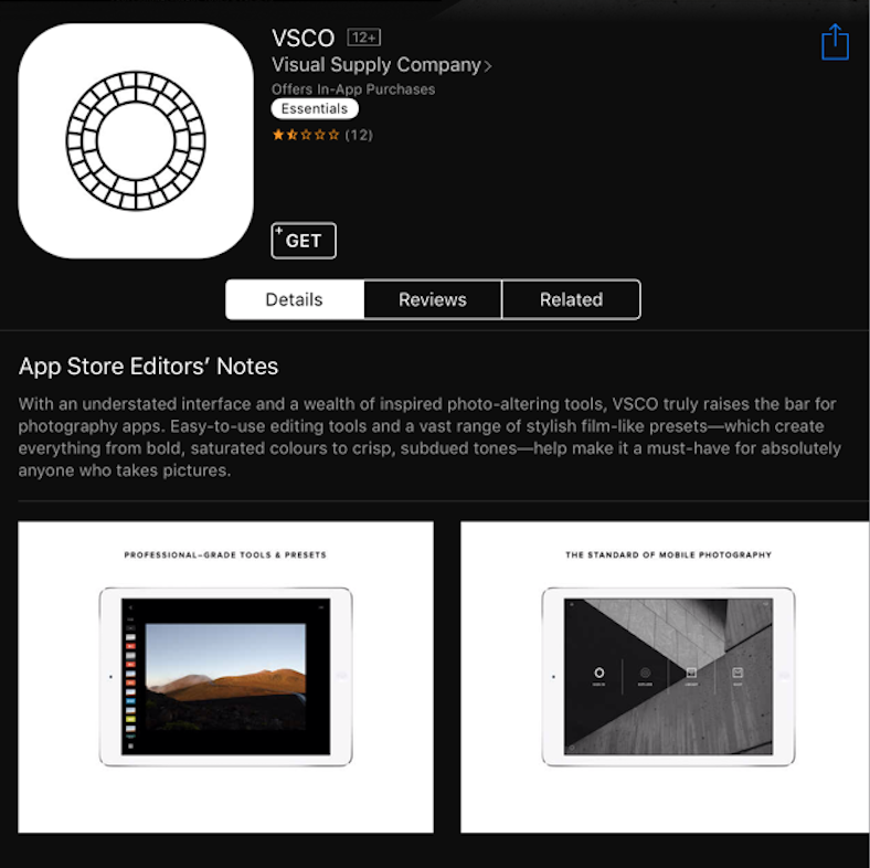
See what I mean? VSCO is one of my favourite examples of app consistency. App store page, icon, screenshots, all are just as minimalistic and clean as the app itself, speaking the right language to its users. This is the result you should be going for to give your users sense of consistency.
Todoist
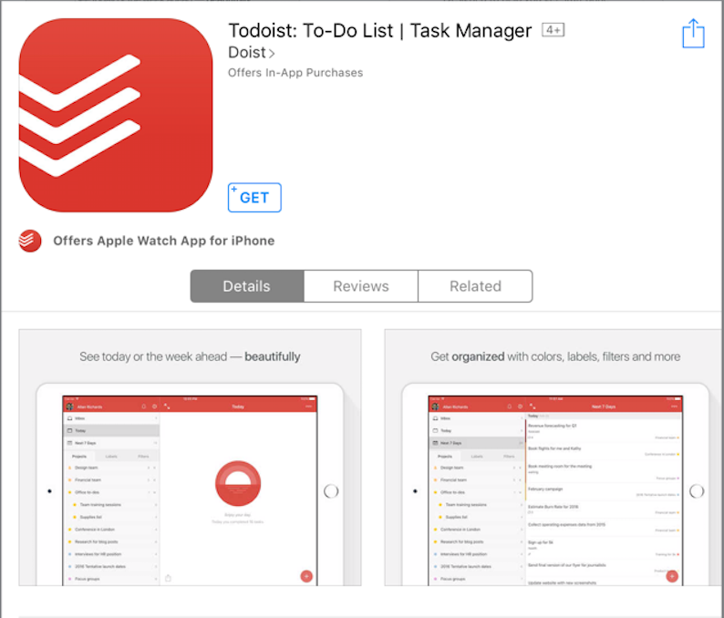
Todoist is another app proving that design can tell us a lot about the features. Simple, consistent, clean design enhances the message about simple task management. Don’t you just feel like you want to organise your life with these lists? Now if you take a look at some other task management apps, you may get a headache from the mess there. Not really convincing.
Monument Valley
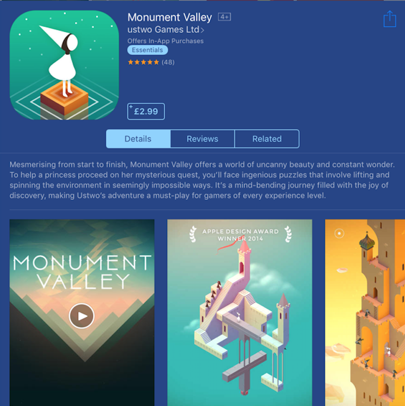
One word that comes to my mind when looking at this app store page is unity. Design, font, colours, description, all matching the ethereal feel of this beautiful app. It just all makes sense together, and if you ever played Monument Valley, you probably know how particular designers are about every detail.
Not so good:
Enpass Password Manager
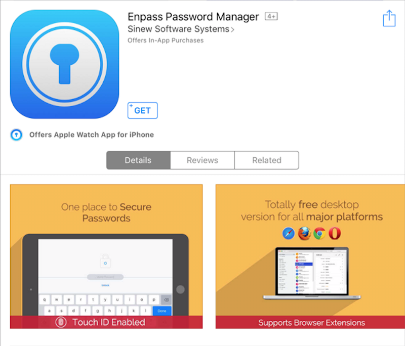
So I’m not saying that everything here is bad, but if you take a look at the app itself, you will notice that screenshots just don’t correspond with the app in any way. There’s no link between app store page and mobile application design, creating this tiny scrunch between finding an app, downloading it and opening it on user’s device.
Vyclone
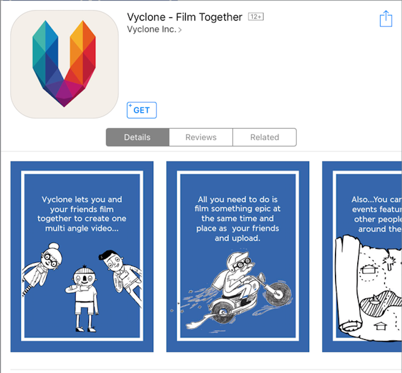
This is an app that I use both as a good and a bad example. On one hand, the icon is really great, catches user’s eye, stands out on the home screen, it’s not only visually appealing but also makes sense for the app that’s about videos, but then we get the screenshots. What? What do they have in common with the icon? So what does the app look like? What’s going on? Is it colorful but bit minimalistic or cartoon style and funny?
Does it influence your App Store Optimisation?
Not directly.
App stores won’t place your application lower or higher in the rank depending on the design of your app and consistency between design and copy.
At the same time, as we stressed many times before, there are some crucial factors for your App Store positions like the number of downloads, the number of active users, uninstalls, etc. And these factors are strongly influenced by the way you communicate with our app users. If the experience is not smooth and clear, your app may easily become forgotten after a few days and deleted once our phone’s storage space gets run out. This will influence your positions a lot more than all your efforts on App Store page.
So, how does the design-copy consistency influence your App Store Optimisation?
Simply put, consistency on every level of communication = better app understanding = better retention = better positions. Yet again it turns out, that App Store Optimisation starts early.
